The old identity did not match the associations people have with left-wing politics. The use of inappropriate colors and internal fragmentation in which direction to profile the party only intensified this identity crisis. The visual identity was outdated and difficult to apply, the visual identity manual was missing.
The website was then poorly optimized, the responsiveness was limited and the page for recruiting new members was not very appealing. In addition, it was unnecessarily relegated to a subdomain, even though it contained a minimum of information, some of which was duplicated from the main page.
New identity, new website
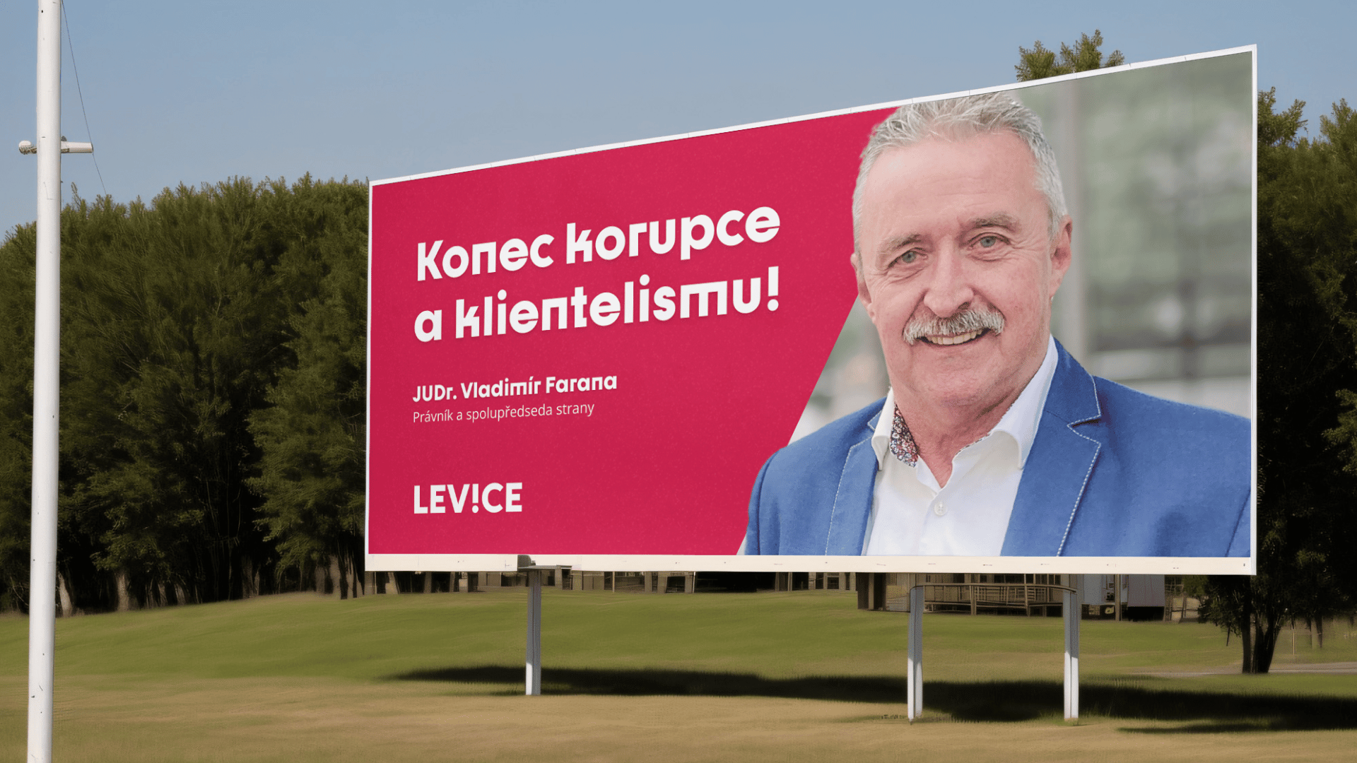
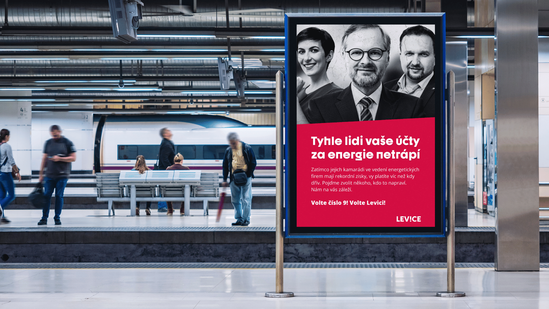
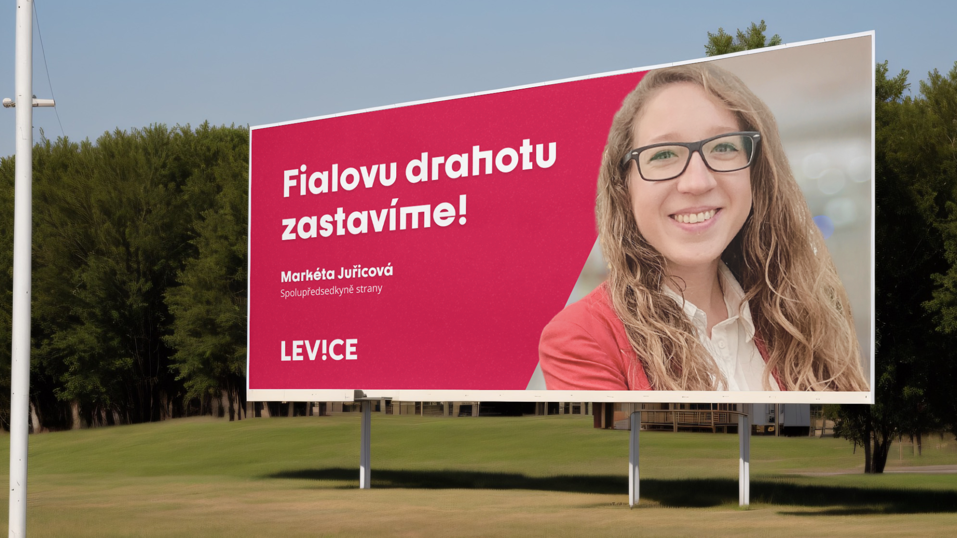
The new identity corresponds to the profiled archetype of the brand, which is the Rebel. A sharp, memorable font, the work with bold colors that are associated with the uncompromising left-wing political party and the slogan with which the new identity was introduced – New Left for new challenges!
As part of visual communication, it was also recommended to pay more attention to the presentation of the leading personalities of the party, especially the co-leading duo. The party thus acquired a new identity and internal recommendations on how to apply it. How they follow these recommendations is in the hands of the client.


